
Three websites for service businesses, a law firm, an air cargo company and a dental care network, each redesigned to earn trust fast and make the first contact easy.
3
Sites redesigned
3
Industries: legal, logistics, health
Live
bonner-law.com
METHODS
Information architecture · Conversion Visual systems · Responsive
- Problem
- Each site made it hard to get in touch: dated design, buried services and calls to action nobody could find.
- My role
- Designed each redesign end to end, from the information architecture and page structure to the visual system and final screens.
- Outcome
- Bonner Law launched and is live at bonner-law.com.
Three sites where asking for help was hard
A law firm, a cargo airline and a dental care network don’t have much in common. Their websites had the same problem: they made it hard for people to ask for help.
I redesigned all three around the same idea. Show people they can trust you, put the main tasks where they look, and make the first contact as easy as possible.
The same problem in three industries
Three industries, one pattern. Here is what each site was getting wrong, and what changed.
Bonner Law
Practice areas buried in dropdowns, and calls to action below the fold.
A restructured menu, calls to action inside the content and simpler forms.
Bringer Air Cargo
Main tasks split into text-heavy boxes, and no clear path for new clients.
A services section and tools hub, a page that follows the sales funnel, and a Get in Touch form.
Usko Health
Patients had to trust a clinic in another country before they’d share any details.
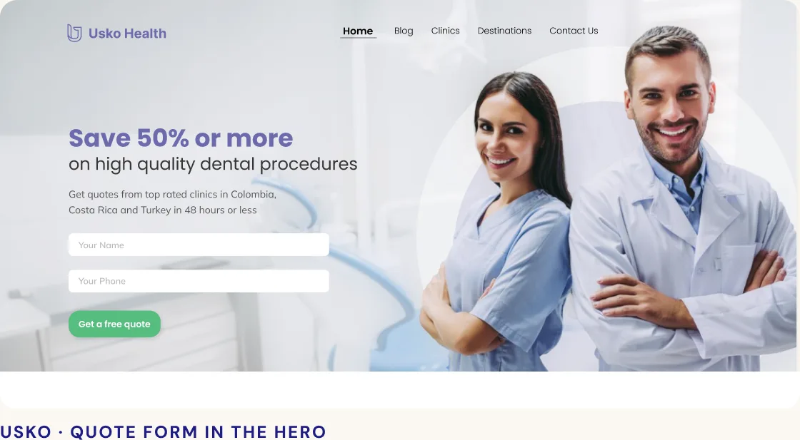
A quote form in the hero, doctors and clinics up front, and visible financing.
Four changes across all three sites
Earn trust before asking for anything
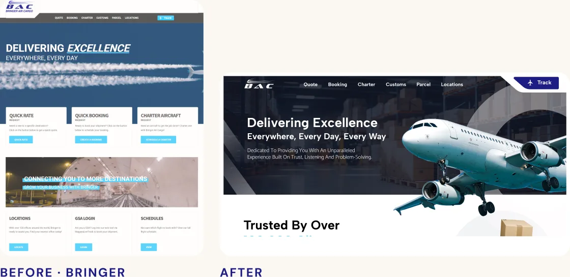
Old designs read as old businesses. I cleaned up hierarchy, color and photography first, and put proof early: Bringer’s client numbers and global reach, Usko’s doctors and clinics, Bonner’s case results.
Put the main tasks where people look
Bonner’s practice areas came out of dropdowns and into the page. Bringer’s quotes, bookings and schedules moved into a services section and a tools hub with clear cards.

Make the first contact easy
Every page ends in an easy next step. Usko’s quote form sits in the hero and asks only for a name and phone number. Bonner’s calls to action live inside the content, and Bringer got a Get in Touch section with the form in plain view.
A system for each brand
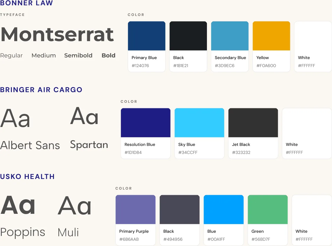
Each site got its own type and color system: Montserrat with deep blue for Bonner, Albert Sans and Spartan with Resolution Blue for Bringer, Poppins and Muli with purple for Usko.
On mobile
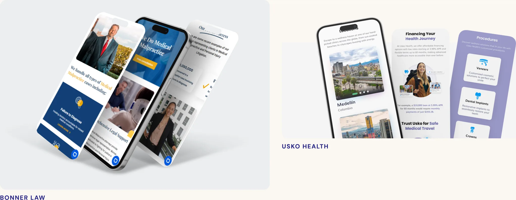
All three sites were designed for phones too, with the same structure and calls to action as desktop.
Bonner Law, live
Live at bonner-law.com
The redesign launched and is the site the firm uses today. Visit it to see the navigation, calls to action and forms working for real.
bonner-law.com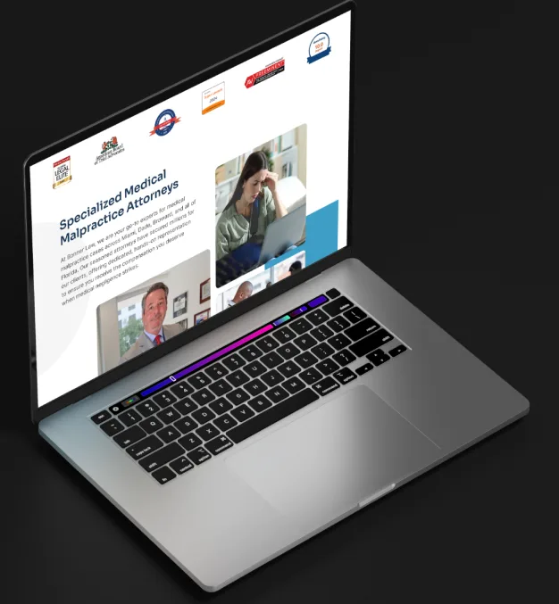
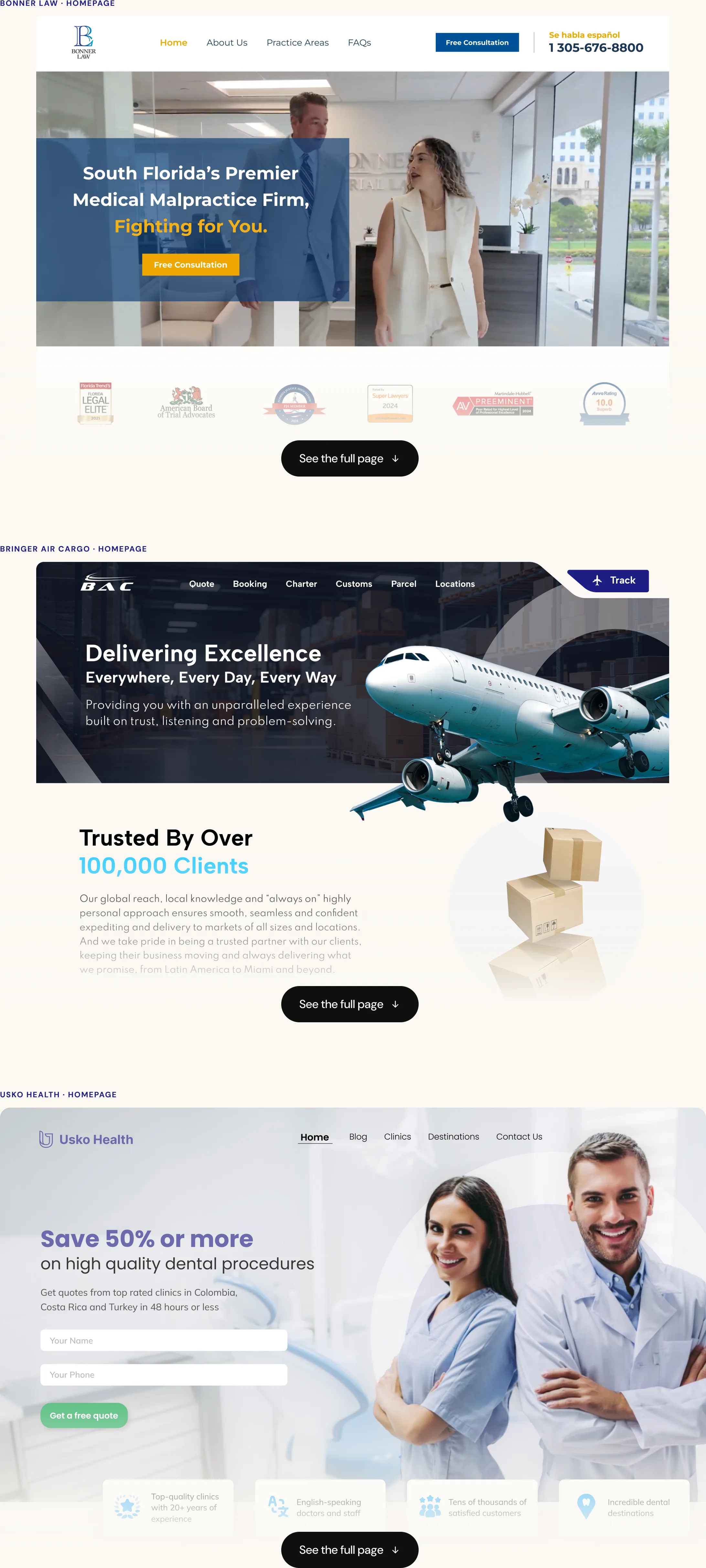
The full homepages
The full desktop homepage for each site.
Next project