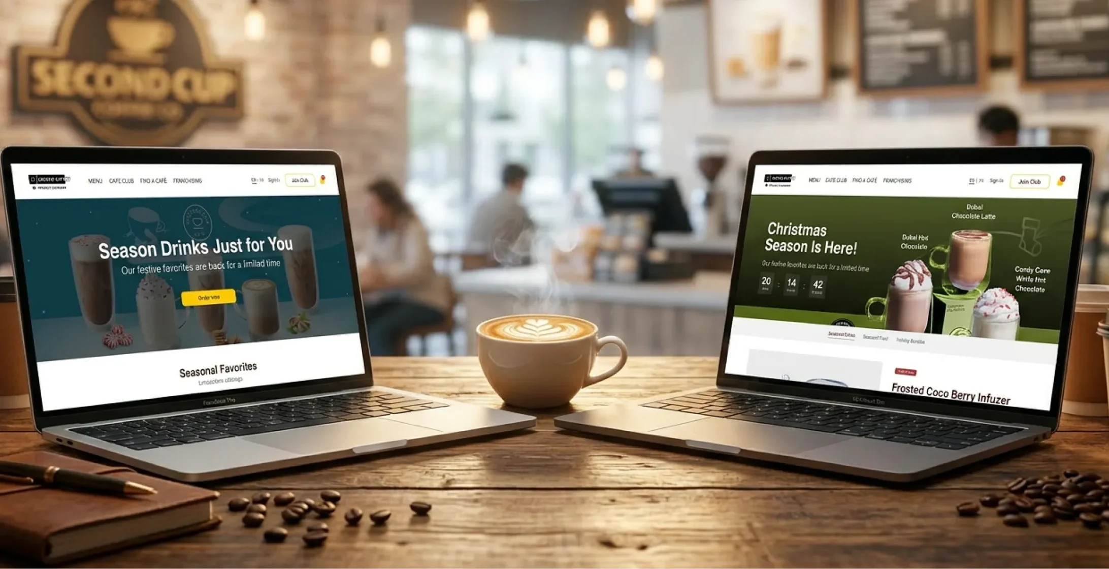
Redesigning Second Cup's website so loyal customers can order and find their rewards without getting pushed to an app.
4.5/5
Satisfaction, up from 3/5
1 min
Task time, down from ~2
100%
Found the loyalty program
Methods
Usability testing · Card sorting · IA · Wireframes · Hi-fi prototype
- Problem
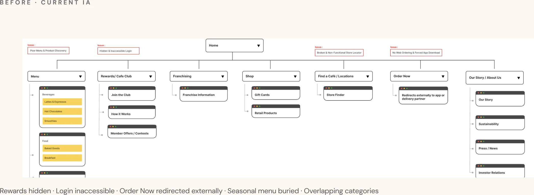
- The website had stopped serving its most loyal customers. Rewards were hard to find, and ordering kept sending people to the app.
- My role
- UX researcher and UI designer on a four-person team, from the first usability tests to the hi-fi prototype.
- Impact
- In testing, satisfaction went from 3/5 to 4.5/5 and task time dropped by half. Every user found the loyalty program.
A website that sent everyone to the app
Second Cup is a Canadian coffee chain with a loyal customer base. But the website had stopped trying to serve them: every flow ended in a dead end or an app download prompt.
Three tasks, tested on the live site
We tested the live site with real users on three tasks: find and sign into the loyalty program, order a customized drink for pickup, and find a seasonal drink and order it for delivery.
Testing showed more frustration than we expected.
Find and sign into the loyalty program
“I don't see anything related to the loyalty program on the main page.”
Order a customized drink for pickup
“It's okay… just many steps. Somehow it's in French. I don't know why.”
Find a seasonal drink and order it for delivery
“They don't mention the item is unavailable until checkout.”
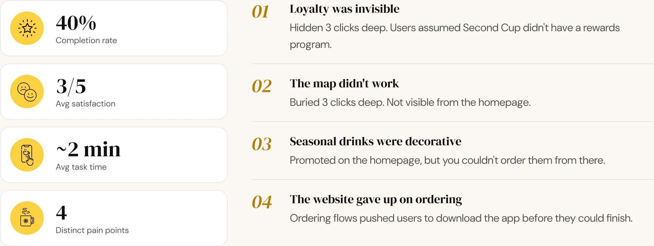
What we kept hearing: four themes, every session.
Four changes from the research
What we changed, and why.
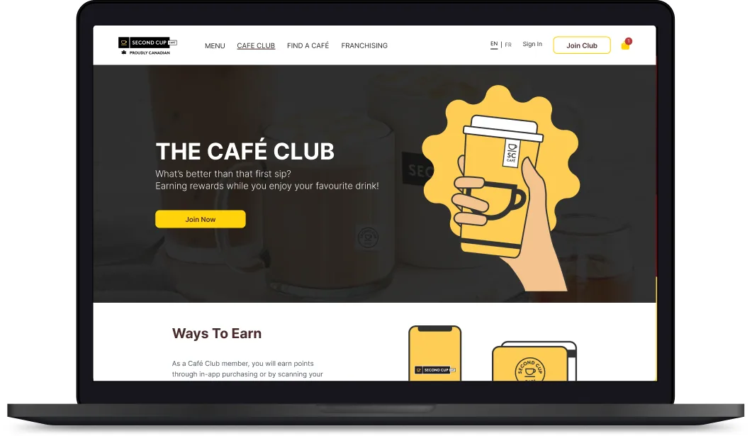
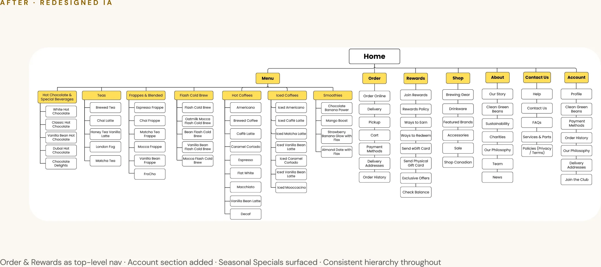
Move Rewards to top-level navigation, visible on every page
Constraint: Rewards were buried 3 clicks deep, and users assumed they didn't exist. Why: It's a retention tool. It needs to be seen before users decide to leave.
Reorder the flow: drink first, location second
Constraint: The flow asked for a location before a drink, which broke the user's mental model. Why: Users think "I want a latte" before "I want Bloor St." The new flow follows that order.
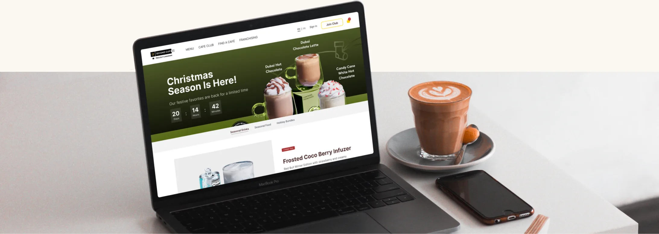
A dedicated Seasonal section with a countdown, Limited Time tags, and direct ordering
Constraint: Seasonal drinks were decorative: promoted, but unorderable and buried in the general menu. Why: Time-sensitive items need urgency and a direct way to order.
Native web ordering. The app is promoted, never required
Constraint: Every flow ended with an app download prompt, so the site couldn't take an order on its own. Why: Users on the website should be able to order on the website.
A new structure from card sorting
We used card sorting to rebuild the structure. Order and Rewards moved to the top navigation, and Seasonal Specials and Account got sections of their own.
Wireframes tested with users
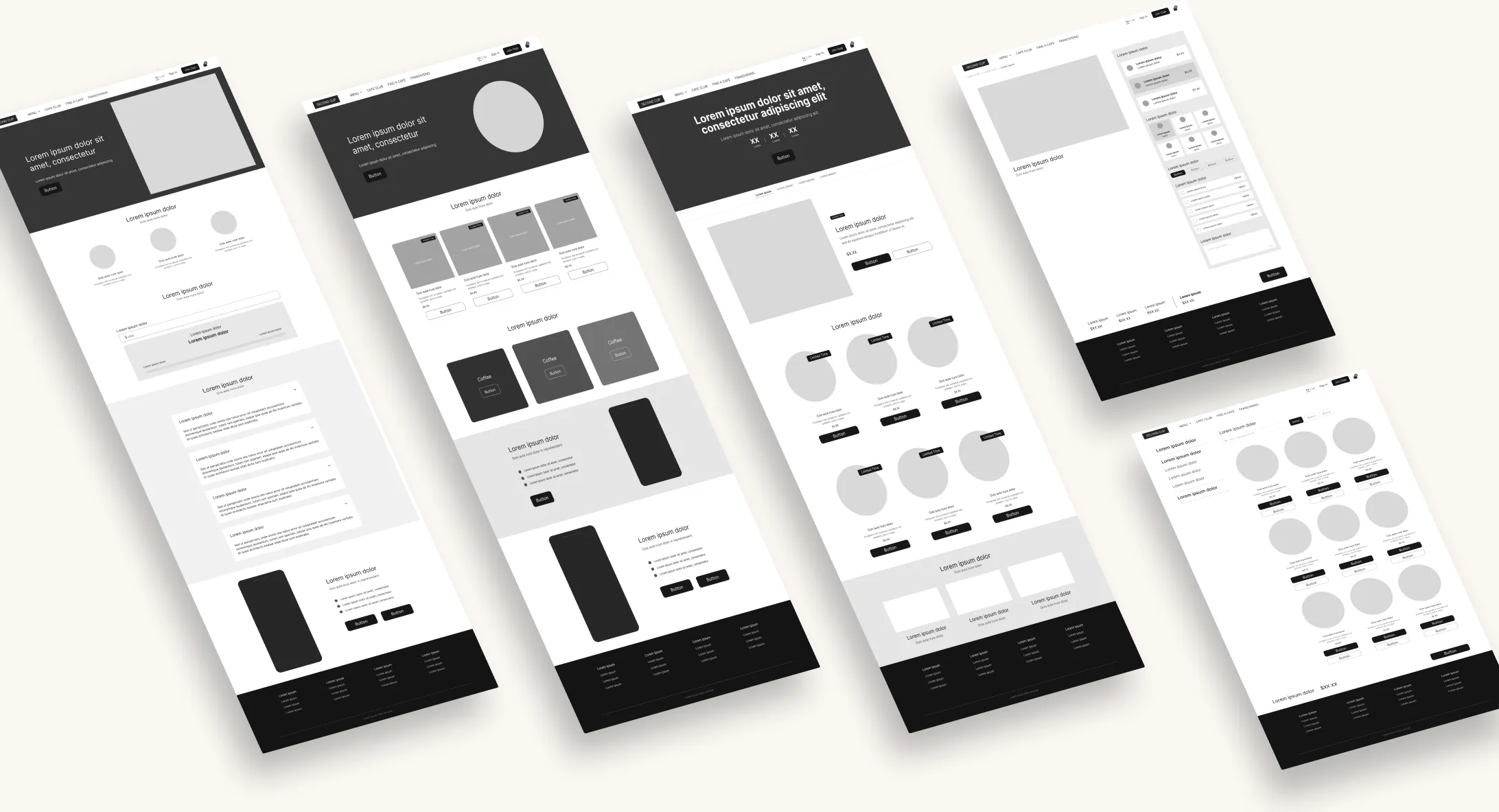
We wireframed the most critical pages, ran think-aloud tests with users, then iterated before moving to hi-fi.
Task time cut in half
We tested the redesign with users on the same three tasks.
Users stopped guessing
They went straight to what they needed.
The complaint evolved
"I can't find it" became "there are a lot of steps." That's a much easier problem to fix.
Conversion opportunity
Users were 72% more confident choosing seasonal items. That's the step right before something goes in the cart.
2 minutes → 1 minute
Fewer steps between wanting a drink and ordering it.

Six pages in hi-fi
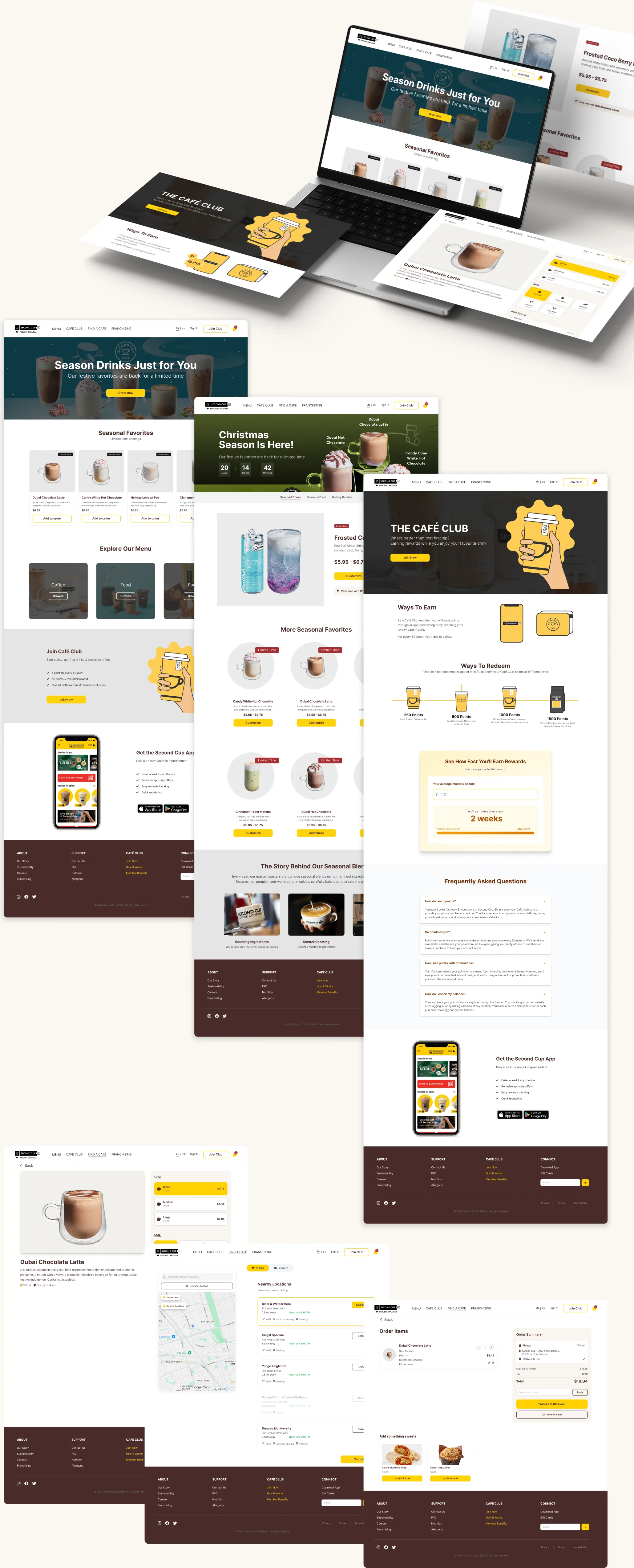
Six pages in hi-fi: home, seasonal drinks, rewards, drink detail, locations, and order.
Next project